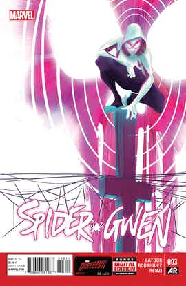
As family dynamics and superheroics collide, Gwen faces a tough foe and an even tougher choice in Jason Latour and Robbi Rodriquez’s “Spider-Gwen” #3. Despite its emotional underpinnings, the issue is heavy on the action, giving Rodriguez and colorist Rico Renzi plenty of room to show off the unique attitude and aesthetics they’ve created for Earth-65. Latour’s speedy, slightly over-quippy script stays dynamic throughout, and he brings together all the conflicts in Gwen’s life in an exciting, believable fashion. While it isn’t perfect, “Spider-Gwen” #3 delivers the most important element of a solo series: a strong, unique voice.
In this issue, Gwen tries to master the work-life balancing act that challenges most Spiders throughout the multiverse. She confronts her father in their home, and they both lay out their points clearly before the Vulture attacks. Latour has to get through this dialogue quickly, and he manages to do so without resorting to speechifying. For example, when Captain Stacy is annoyed to find Gwen still in costume, he says, “This our home, Gwen — not your secret headquarters.” Latour layers the core problems into the simpler one at hand.
That said, Latour also loves writing quips, and the issue contains just a few too many. They aren’t necessarily flat or unfunny but, when there are so many, they lose the surprise factor that really makes me laugh. They feel more performative and less like a natural part of the character’s dialogue.
Though the script is quick and credible, Robbi Rodriguez and Rico Renzi really wowed me. Rodriguez’ style is great for a Spider book; his characters are sinewy and speedy, and he knows how to make aerobatic fights into a spectacle. Both Gwen and the Vulture spend much of their climactic fight leaping and flying. It’s easy for those activities to look static, more like hovering than actively moving, but Rodriguez imbues them with momentum. The fights also work in part because of Gwen’s body language. Her default pose is shoulders back and hips squared; when she goes from a pose that grounded to a mid-air leap, it really reads.
Rico Renzi’s palette is awesomely pop-punk, amping up the spirit of Gwen’s costume. When the action escalates, he emphasizes the scene with bright pink and green instead of the traditional primary. The result is a look and feel unlike other any of Marvel’s other titles.
Clayton Cowles’ lettering and Idette Winecoor and Jessica Pizarro’s design complete the book. This is a textbook example of how lettering is one of the industry’s unsung heroes. The onomatopoeia effects use blaring fonts and ombre colors that make them feel like they’re reverberating. From “twamp” to “bang,” they look just as appropriate describing a roundhouse kick as a guitar riff.
Much as I liked the issue itself, the April Fool’s Day ad in the back was at best flat and at worst transphobic. The premise of the joke is Marvel’s launch of “Spider-Gwen-Man,” the punchline being an image of Gwen with a beard. I guess they were going for incongruity but, when the “funny” thing is that someone who dressed like Gwen might happen to have a beard, it’s uncomfortable. People’s genders — and their performance of those genders — aren’t punchlines.
Apart from that misstep, “Spider-Gwen” lives up the hype. It’s a gorgeously designed and drawn book with an effortlessly likable protagonist and an alternate Earth that rises above gimmick.

